Cafe Zara ReBrand
Cafe Zara Rebranding
Embarking on the exciting journey of rebranding a coffee shop with a lackluster logo, my mission unfolded with the quest to revitalize its identity and captivate the elusive target audience. Delving into the realm of local independent coffee shops for inspiration, my research led me to the perfect candidate: Cafe Zara, nestled in the heart of East Providence, Rhode Island. This chosen haven promises a canvas for transformation, where creativity and innovation will breathe new life into its brand.
Meeting the Coffee Competitors
Before I started rebranding Cafe Zara, I had to visted Dunkin andStarbucks in for different locations in Rhode Island. After, I scan the different buildings and elements, I knew what I was looking for and how Zara can compete with the big timers.
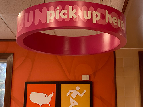
Dunkin on Gano ST Providence.
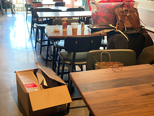
Starbuck on Division St East Greenwich.
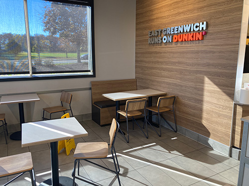
Dunkin on Division St East Greenwich.
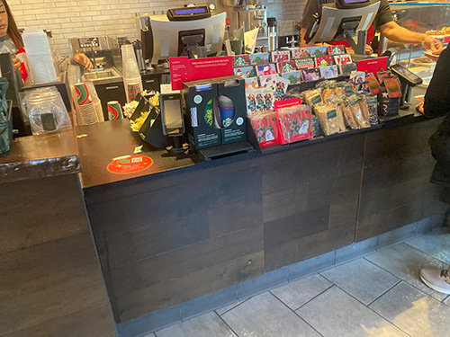
Starbuck on Angell St Providence.
Target and Persona
Cafe Zara’s personality is calm and collective place for people to get their work done or just have lunch. Cafe Zara is a place for young and adults.
Persona of Cafe Zara
The target audience for Cafe Zara are young adults and adults as they are going to a place to meet friends or they are going to the cafe in order to get work down.
Cafe Zara’s Whitespace Analysis
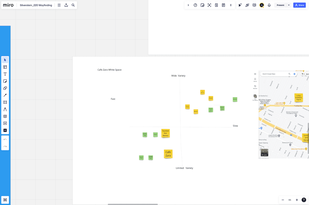
The Target Value Prop Canvas of Zara
The target value prop canvas shows that the serves is friendly and that food is always fresh as they don’t use process foods. They have sever tea and coffee. There are always have great an option to order online, which is a positive impact on the serves.
Improving the Target Value Prop of Zara
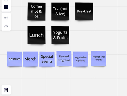
While they have great Tea and Coffee there a few weakness in the cafe. For example, there is not enough options for people who have specific interesting needs such as vegetarian or those who are lactose intolerance. This is a new trend that is appearing as restaurants are adapting to the new area of surviving food to the people.
Hierarchical List
Target Persona Journey Map
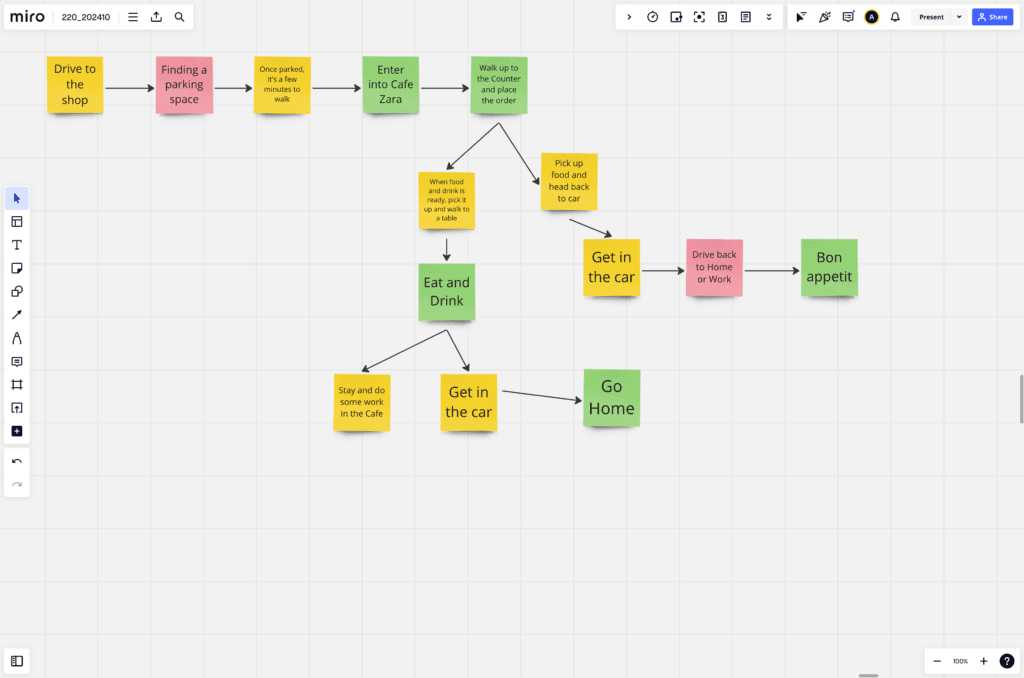
When I started the process I place the on journey on the process from driving to the shop to place a menu with the menus. The color code plays such as yellow is median, red is hard and green is easy. This allows me to think about the process of each steps of the target customers and how easy/hard it is to get through each step of the menu.
The SWOT Diagram of Cafe Zara.
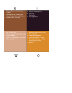
The appearances outside lacks a charming feeling and there is not a parking lot to the building.
The rivals are Dunkin and Starbucks. Also there a bakery, which has treats for everyone.
The Zara’s SWOT Analysis
Adding more vegetarian and vegan options, aligning with the growing trend of dietary preferences shifting away from meat and animal products. Also, addressing dairy alternatives beyond almond milk could cater to customers with specific dietary needs.
a strategy employed by many successful companies, would allow customers to earn discounts on their purchases after reaching certain milestones.
Selling branded merchandise, including clothing, accessories, and small items, follows the trend seen in independent stores and restaurants, enhancing the brand’s reach and appeal.
Target Revised Value Proposition for Zara
For the Value proposition, I aimed for simplicity and inclusivity. After researching various companies, like Dunkin with “America runs on Dunkin,” I brainstormed ideas and settled on ‘Start your day the Zara way.’ This proposition is universal, welcoming everyone into the Cafe Zara family.
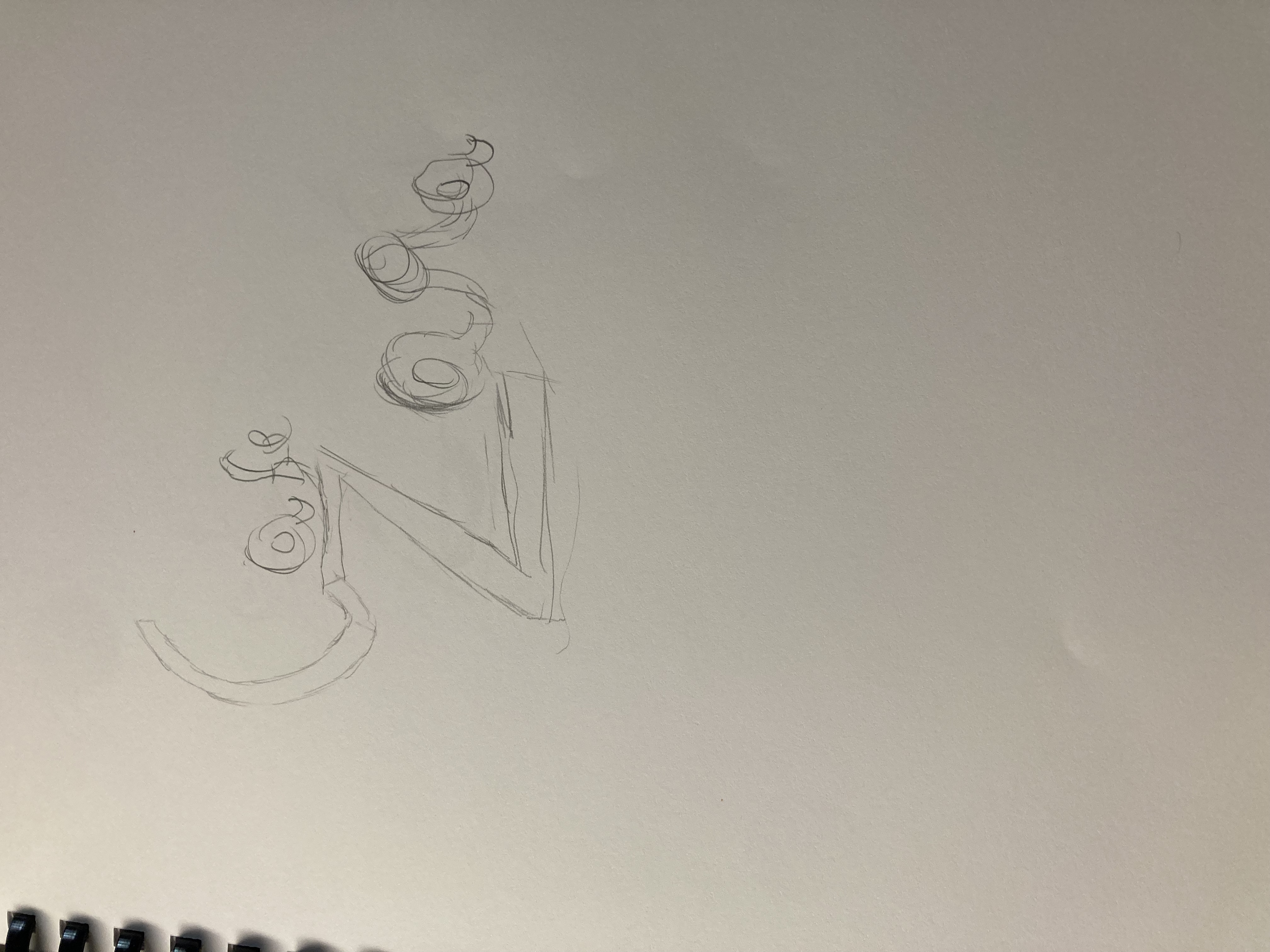
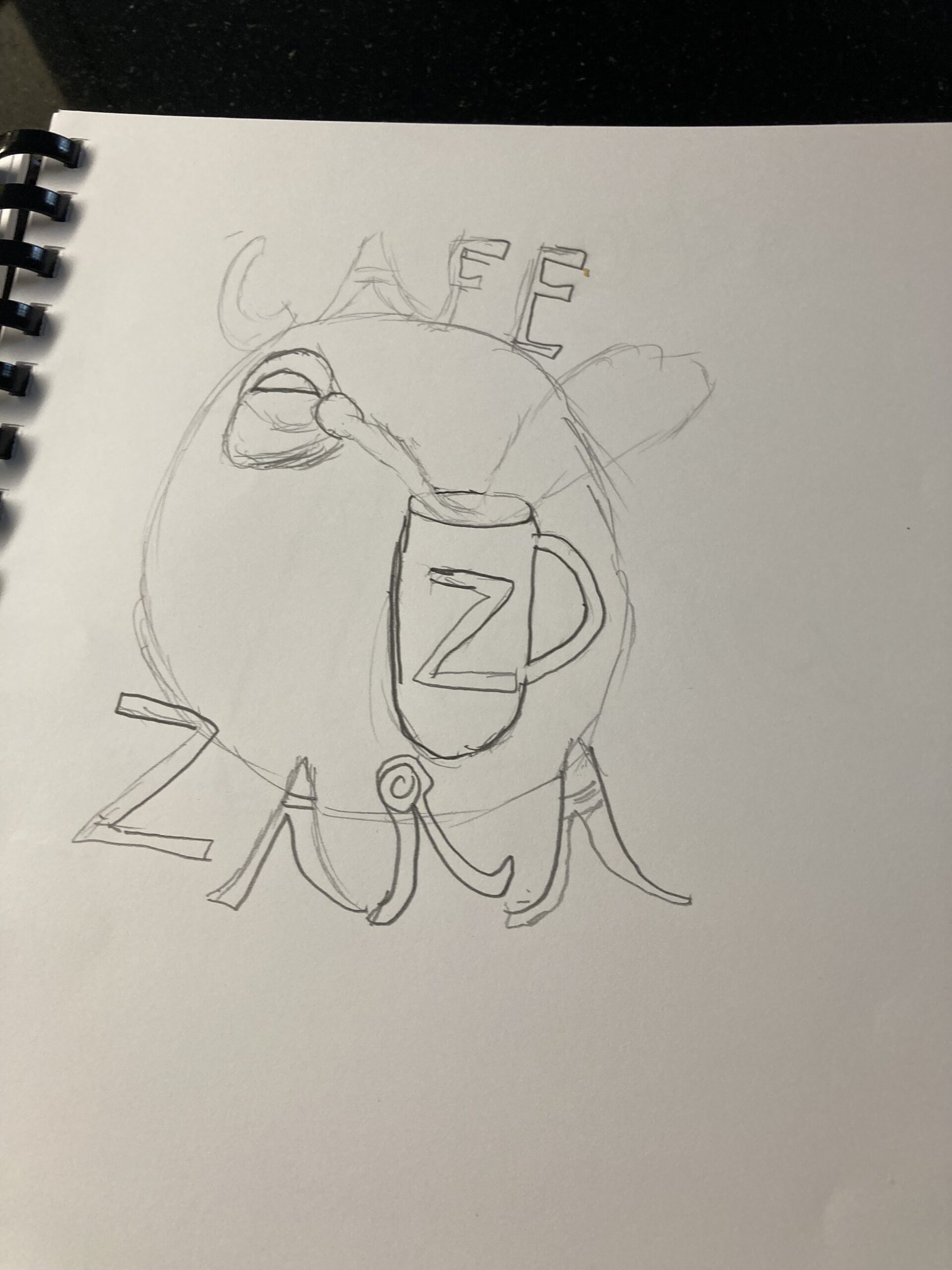
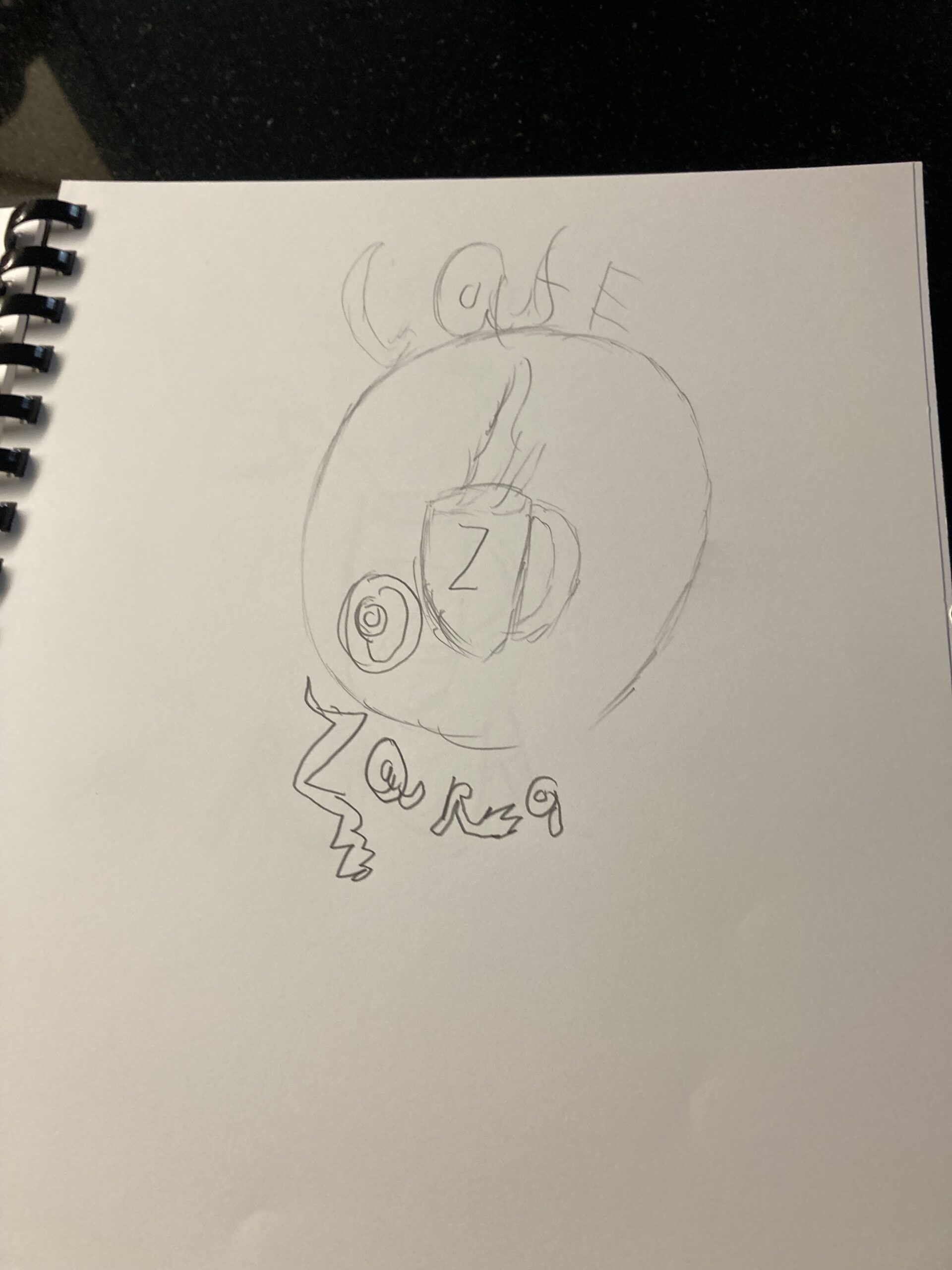
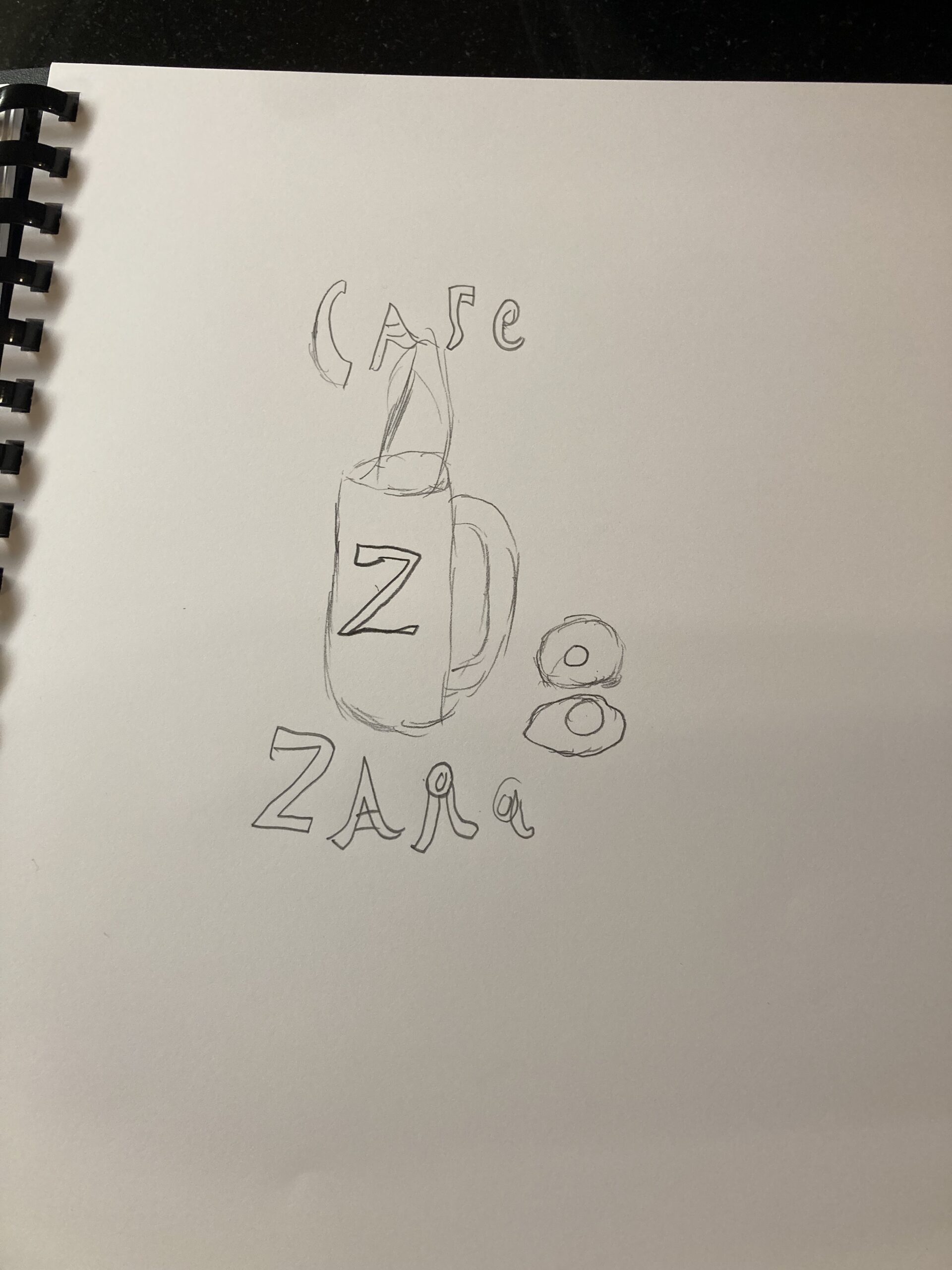
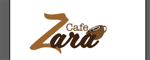
Logo Evolutions of Cafe Zara
My process of creating logo was starting logos from sketches to use the logos from Indesign.
Creating the Logo Merch for Cafe Zara
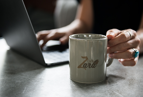
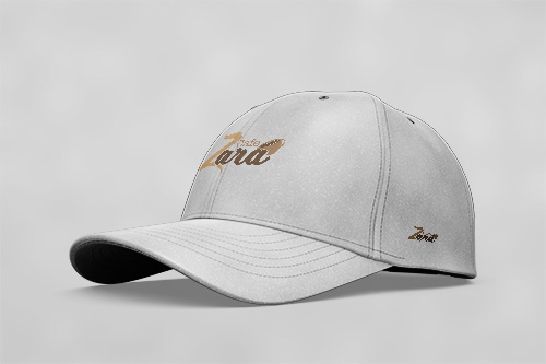
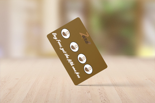
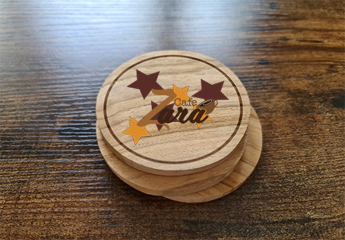
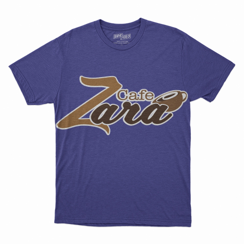
These are regular merch that are for sell year around who people who want to buy those items. This includes more plain t-shirt as well regular mug. This was part of the regular sales. The last items is cap as people can buy them. This was part of the regular sells for the daily items.
The Package Design of Cafe Zara’s K-Cups
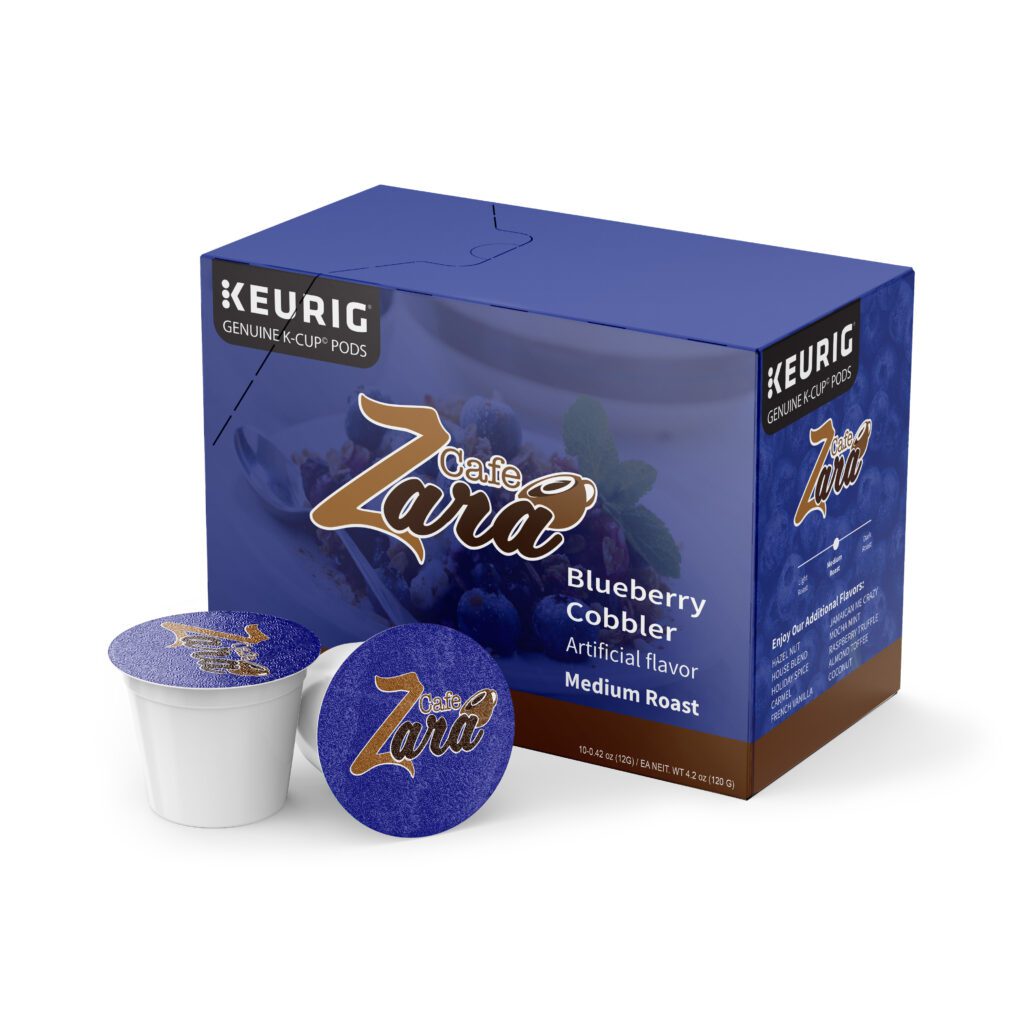
After getting the box outline, I have use the dark blue in order on the package. Once that was done I use the image in back of the coffee in order to create a effect for the box. Once that was done, I place the logo on the top of the package in order to get ready for the final.
creating the Target Mobile Website
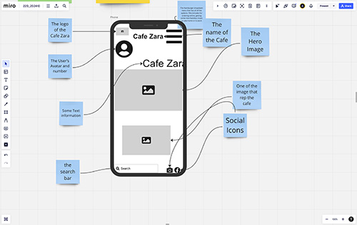
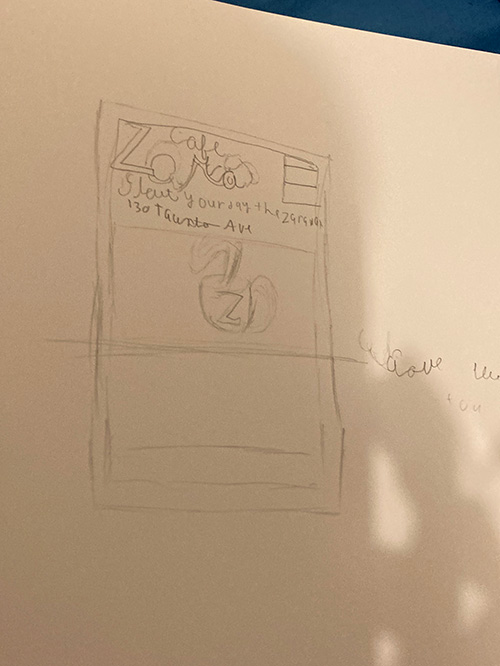
This was process was a slow start from the beginning as it was a starting process. First I created a outline on Miro board with a mobile outline and place the items in the frame. After that, I began with the sketches on for a rough draft as it help me to create outline. In the final form that shows the homepage, the merch and the menu pages.
Creating the Prototype of the Mobile
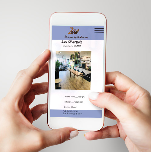
The final out come of the mobile website.

