NEIT’S graphic design LOGO
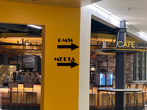
The assignment was to create a way finding project to bring more potential students into the Graphic Design department. The intention of this project is to help students who are newcomers, as well as their parents, alumni and guest speakers who have never been to New England Institution of Technology’s East Greenwich. My Process was starting from taking the photos to help me to create a Way Find path and then creating the logos of my process. This process has helped me to get a better understanding of the steps to create the final process of the NEIT’s Kiosk.
The first step of this process was for me wast to take photographs. The reason was for me to create a path finder that students will be able to help them find there destination as this is a confusing campus design.
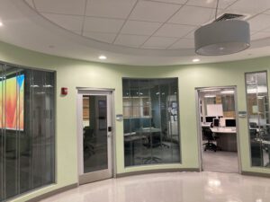
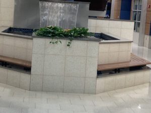
The sketches
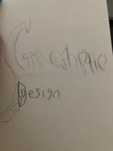
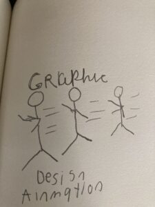
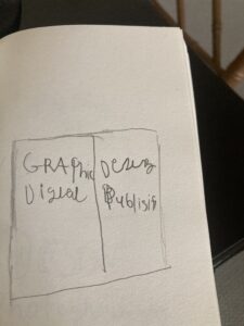
Once I have taken the pictures of the key location of the school, I began to sketch different ways for the word ‘graphic design’. The process was to make the words stand out in order to draw the eyes of the many people. The word graphic itself stands out as if it were 3-D and have a tool that an artist will use like a pencil.
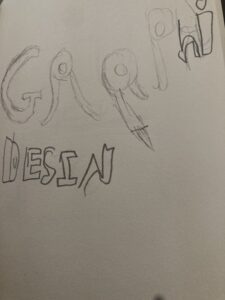
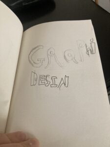
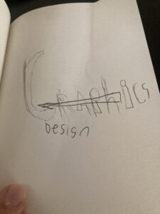
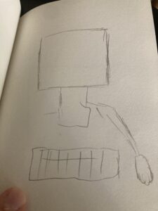
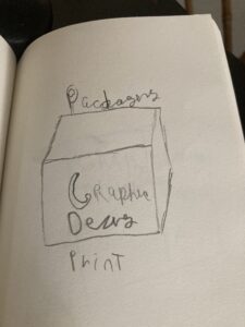
After, I was done with sketching differet words of graphic design, I began to sketch the tools that a graphic designers would use from a computer to a tablet, which helps them to draw more and looking at two scrrens at once as well with a camera.
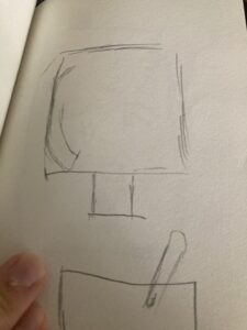
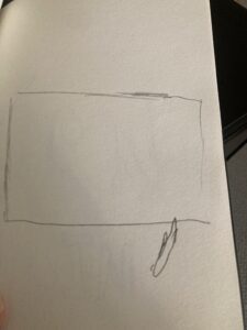
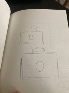
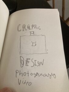
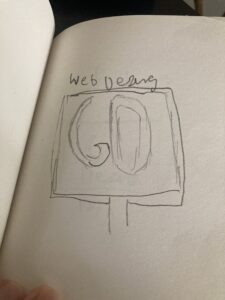
The last step in sketching was to create a combination of the logos and Picture cons. I had to think and create different ways in order have the words and the icons balance each other instead of one having a greater effet than the other.
The Final Logos
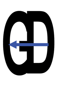

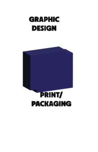


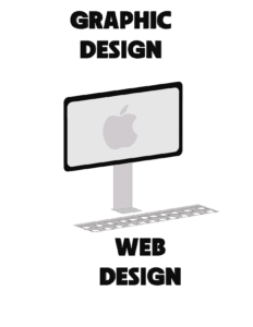
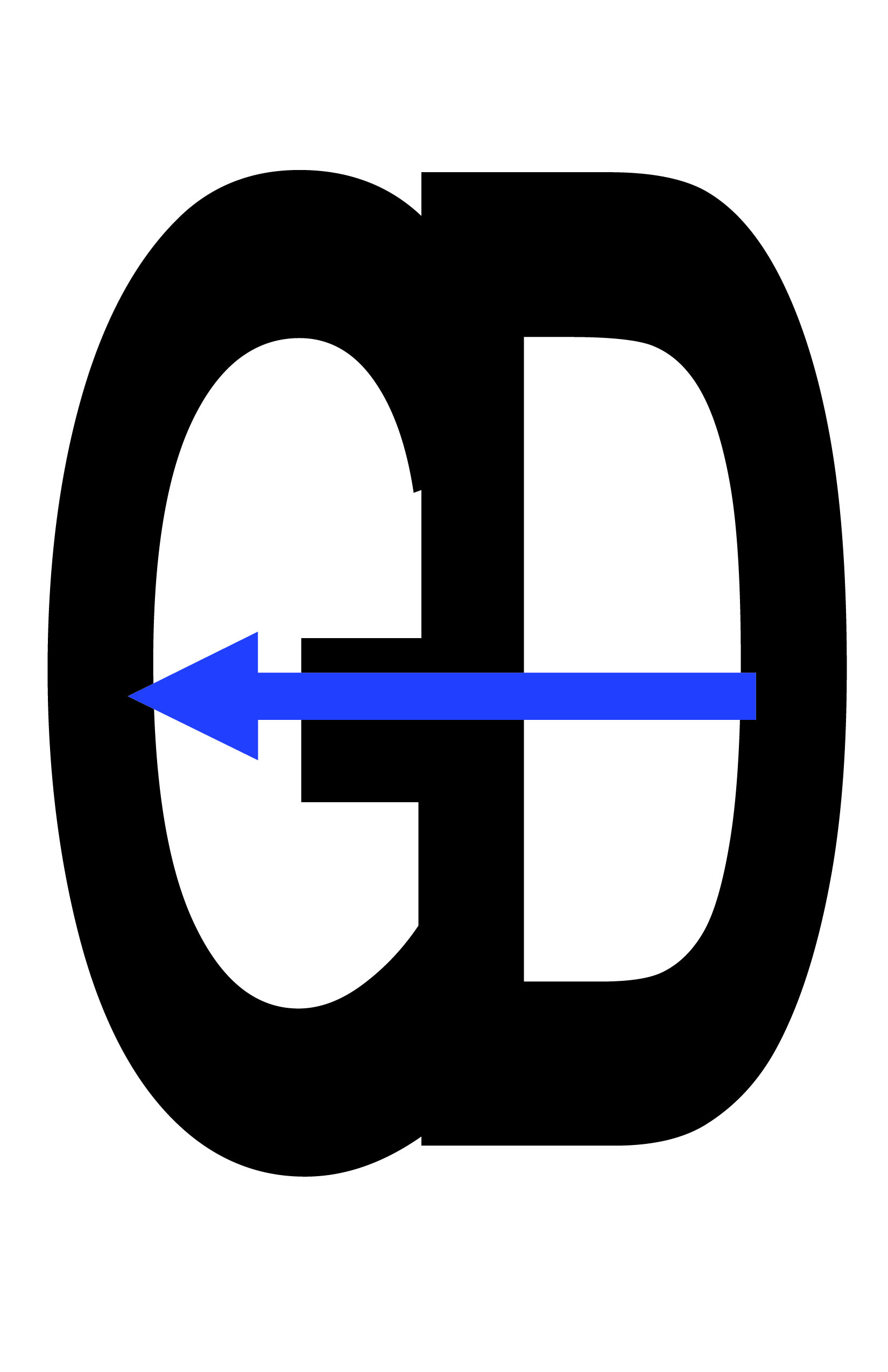
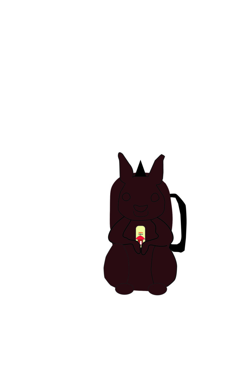
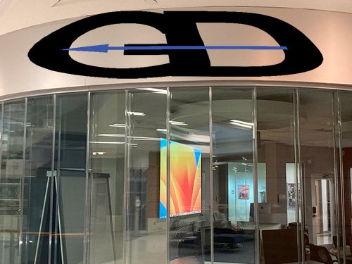
After I have complete the rough drafts of the logos, I worked in Illustrator to create this icons. They are the items that a graphic designer will use in the real world. These icons represent the differt areas of graphic desig. I wanted to make them 3-D in order to standout because creating a 3-D objects can draw atteion to it. As for the GD logo, I combined them together in order as well as a blue arrow. The arrow is blue, which is represent NEIT.
The Logos in Place
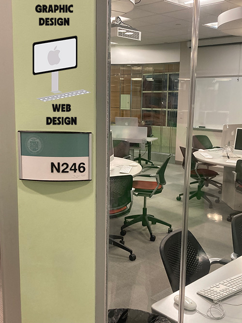
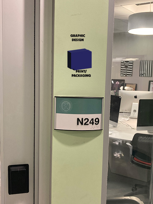
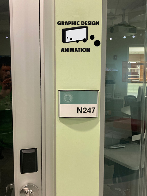
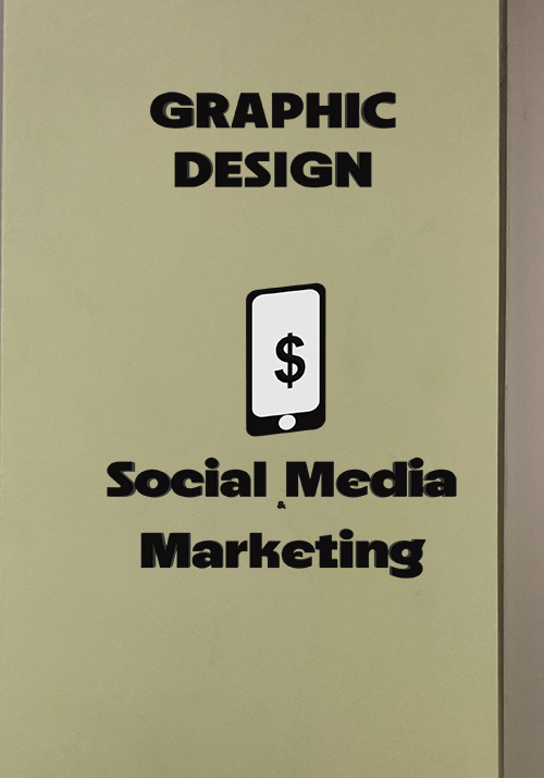
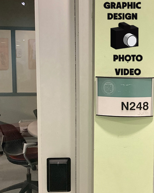
Once I was done with creating the logos, I opened photo shop in order to place the logos and icons on the walls in the Graphic Design Lab. At first, I try to place them above the room but it was not working, so I place them in next to the wall and it has strong place on the wall.
The Way Path
The Keioks
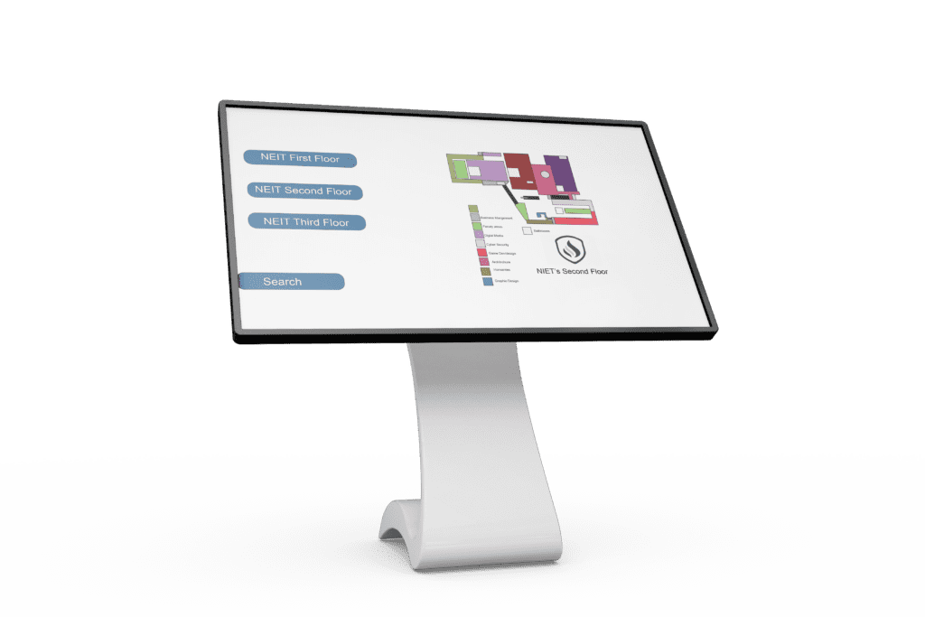
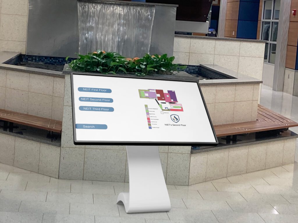
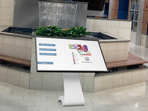
This is the final version of the kiosk that is place in front of the koi fish pond as it will help students find there way to their classrooms. After showing the first version to some of my colleagues, they gave me some suggestions on how to improve it. So I went with a biger version of the Kiosk. This will allow the students not only to find their way but they can also do a quick search as well to find the rooms that they need to go to.
