Redesigning Chepachet Farms’ Maple syrup
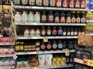
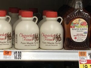
When the moment came to select a product for redesigning its current design, I went to Eastside Marketplace and found Chepachet Farms’ Maple Syrup. I have never seen this maple syrup before in any other stores when I went food shopping, nor have I even heard about this Chepachet Farm. When I saw this design, it was awful to look at, as there were many flaws with the design. First, it looks like a jug of moonshine, which would have made people not believe it to be maple syrup. Then other elements were harming the product. The brand’s name was typed in cursive, and people will not take the time to read it. The color scheme of the jug was a pale yellowish color with disease and people would just ignore the product.
When I began to redesign packaging design for the packaging design, I sketched many ideas for different ideas. This included Maple syrup designs. Many designs have a squirrel, a farmhouse, and a hummingbird. I chose them because I was trying to find some of the designs that represent maple syrup, so I researched to find the right one.
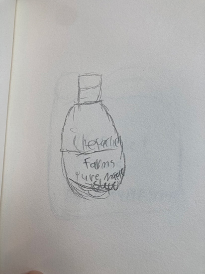
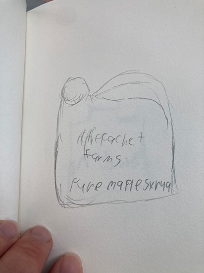
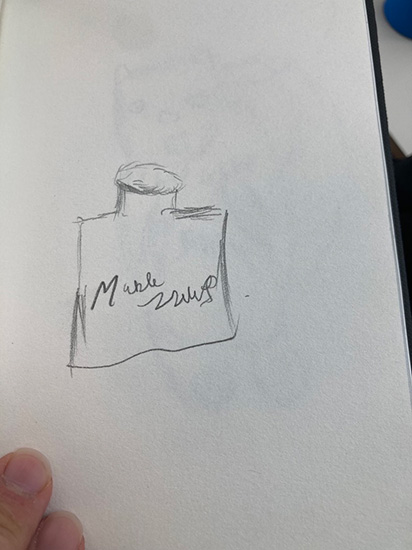
These were the okay designs.
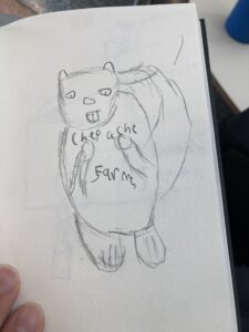
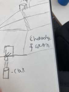
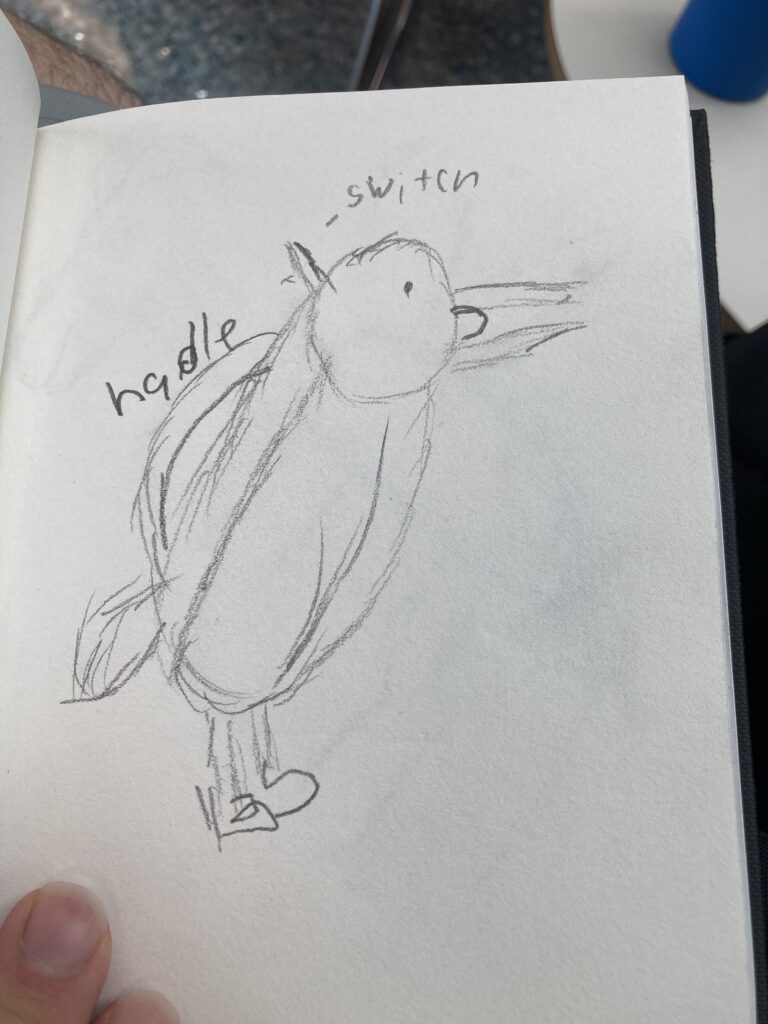
These are excellent designs for the final draft of the design.
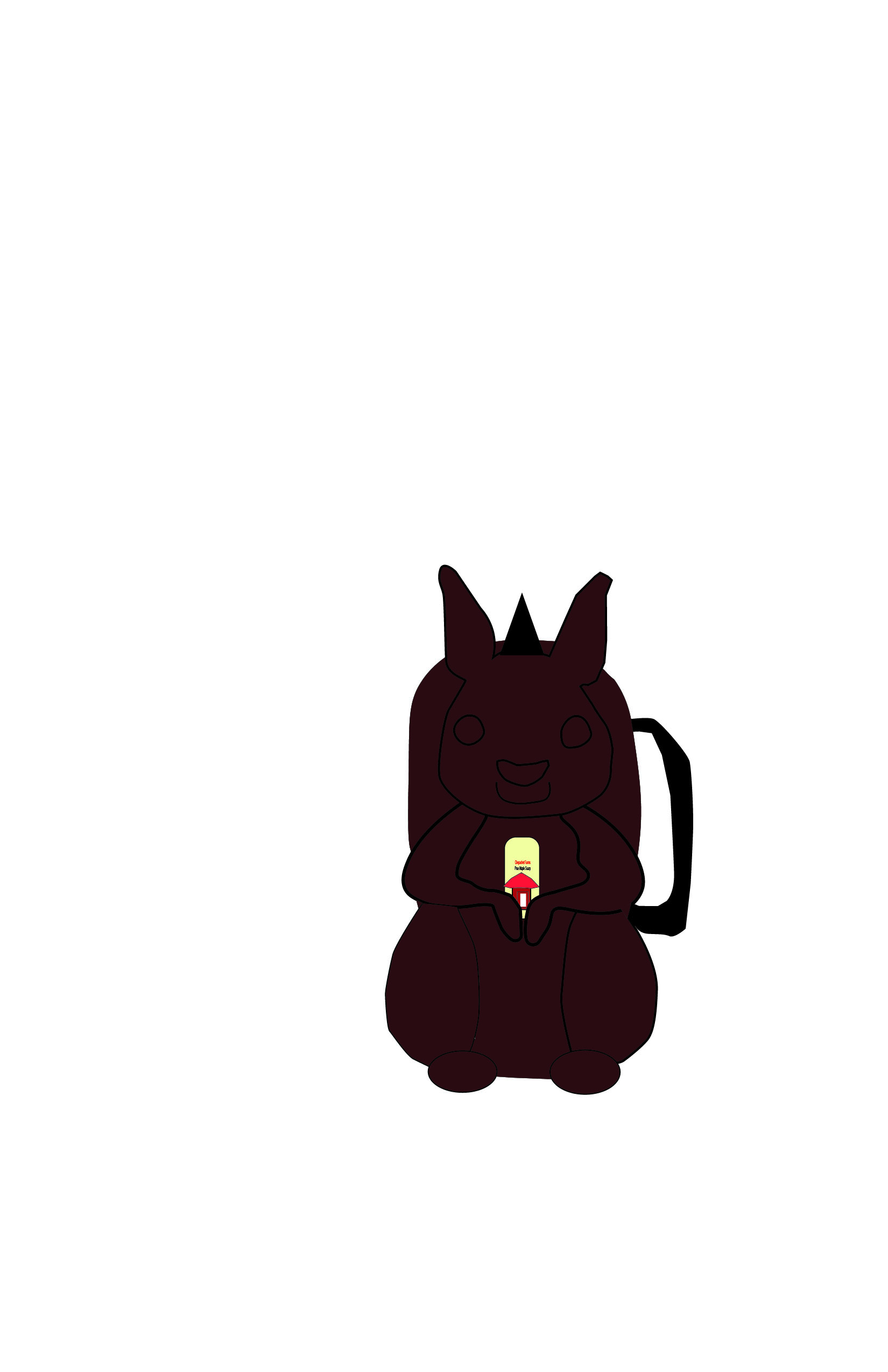
When it came to the final pick for the product design, I went a head and pick the squirrel. After many talks with my colleagues, I have finally pick the create the final product of the maple syrup.


